
Typography 101: Font Basics
Typography is the art or process of printing with type. However, in modern usage typography includes all manner of non-printed letter forms such as websites, eBooks, electronic billboards, and even textiles. Through the use of type, a person can visually tell a story using little to no imagery. This post is intended to teach you about the anatomy of type and to help you better understand what to look for when choosing your next font.
First, the Typography Basics
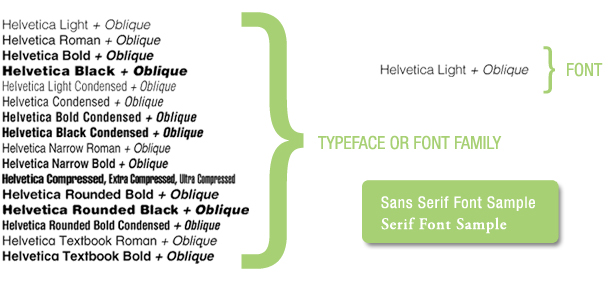
Typeface vs Font, What’s the difference?
A typeface, also called a font family, is a set of fonts designed with a stylistic unity, each comprising a coordinate set of glyphs. A font is a complete character set of a typeface at a particular size, weight, and style.
Serif vs Sans Serif, Which one to use?
Serif letters are drawn with features at the ends of their strokes. The serifs are the little feet we see in fonts like Times. These are some of the oldest type designs. The feet along the baseline help guide the eye from left to right, making them very ‘readable’ fonts.
Sans Serif (french for “without serifs”) are letters drawn with straighter lines and no feet. Their larger letterforms make them very legible, but can cause greater eye strain when used in long runs of text. Helvetica is considered the quintessential sans serif font.
The Anatomy of a Letter
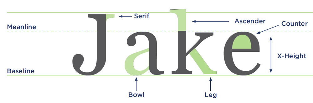
There is a standard set of terms to describe the parts of a character. These terms, and the parts of the letter they represent, are often referred to as “letter anatomy” or “typeface anatomy.” By breaking down letters into parts, a designer can better understand how type is created and altered and how to use it effectively.
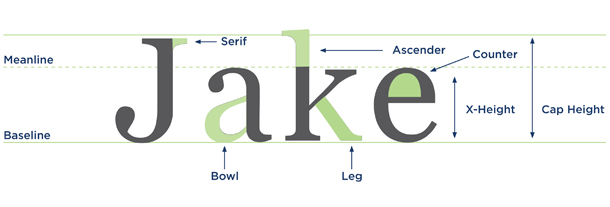
- Baseline – The baseline is the invisible line on which characters sit. While the baseline may differ from typeface to typeface, it is consistent within a typeface. Rounded letters such as “e” may extend slightly below the baseline.
- Meanline – The meanline falls at the top of many lowercase letters such as “e,” “g” and “y.” It is also at the curve of letters like “h.”
- X-Height – The x-height is the distance between the meanline and the baseline. It is referred to as the x-height because it is the height of a lowercase “x.” This height can vary greatly between typefaces.
- Cap Height – The cap height is the distance from the baseline to the top of uppercase letters like “H” and “J.”
- Ascender – The part of a character that extends above the meanline is known as an ascender. Note that this is the same as extending above the x-height.
- Descender – The part of a character that extends below the baseline is known as a descender, such as the bottom stroke of a “y.”
- Serif – Fonts are often divided into serif and sans serif. Serif fonts are distinguishable by the extra stroke at the ends of the character, known as a serif.
- Stem – The vertical line of a “B” and the primary diagonal line of a “V” are known as the stem. The stem is often the main “body” of a letter.
- Bar – The horizontal lines of an “E” are known as bars. Bars are horizontal or diagonal lines of a letter, also known as arms, and are open on at least one side.
- Bowl – An open or closed circular line that creates an interior space, such as in “e” and “b.”
- Counter – The inside of a bowl.
- Leg – The bottom stroke of a letter, such as the base of an “L” or diagonal stroke of a “K.”
- Shoulder – The curve at the beginning of a leg of a character, such as in an “m.”
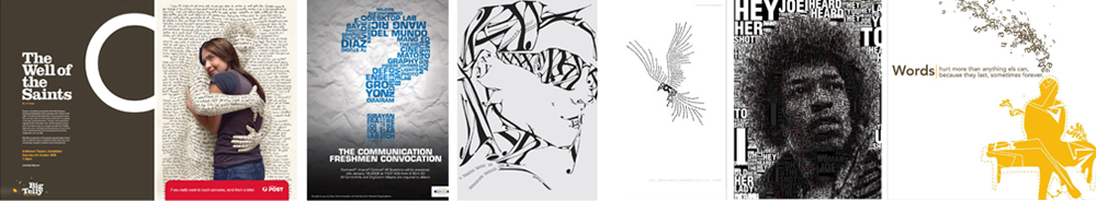
Examples of Great Type-Only Design
Want to talk branding and design? Contact us at Jake Group today. We’d love to see how we can work with you!
Want to learn more? Visit Canva.com for an illustrated glossary of typographic terms.