
Creating a Memorable Brand: Four Principles of Effective Logo Design
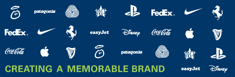
When you think of a memorable brand, what comes to mind – Apple? Nike? Perhaps FedEx with its subliminal arrow to represent speed and precision? These bold, iconic logos are relevant designs that stand the test of time.
At Jake, our creative team has developed striking visual identities for entrepreneurial start-ups to premier global investment firms. And in all cases — regardless of client size or industry — we rely on four basic principles of effective logo design:
#1. RELEVANCY: TELL A STORY.
A logo is more than just a wordmark or symbol; it is a visual representation that reflects your company’s philosophy and values. While it’s not necessary — or, in some cases, even recommended — that a logo include a literal interpretation of your value offering, it should always evoke positive emotions that tell a story about your brand.

#2. TIMELESSNESS: TREND LIGHTLY.
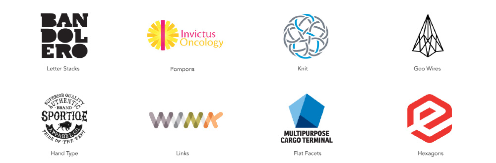
Consider how your logo will look 10 years from now – will it still be relevant or feel dated? While it can be tempting to follow the latest design trends (whether stacked letters, hexagons, or the ubiquitous swoosh), a strong logo should be truly unique and avoid design clichés and gimmicks.
#3. SIMPLICITY: THINK ABOUT SCALABILITY.
The KISS principle applies here — Keep It Simple, Stupid! Although intricate logos can look great in large formats, they don’t always translate well to smaller applications. Think about how your logo will work on a business card or embroidered on a golf shirt. Even at a small size, a strong logo should be instantly recognizable without being overworked.
#4. VERSATILITY: DON’T RELY ON COLOR.
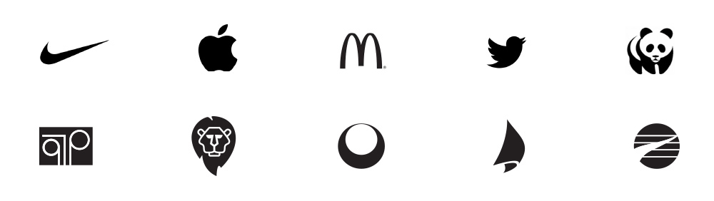
While color is an important component of your visual identity, an effective logo should render perfectly in black-and-white. In fact, for many logo designers, the creative process begins in grayscale to allow clients to evaluate style and shape before considering the impact of color. A logo that can stand alone in one color also ensures that your brand will work across a variety of mediums, backgrounds and applications.