
Classic Blue: Pantone’s Color of 2020
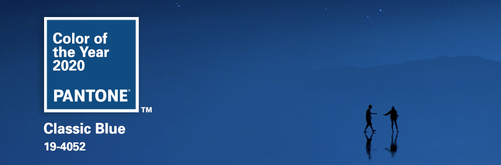
After years of bright, energetic colors of the year (Living Coral, Ultraviolet, and Greenery), Pantone has selected a calming shade of blue to ring in the new decade. Classic Blue is a beautiful, timeless hue that you’ll be sure to see across all industries, including Fashion, Décor, Food & Beverage, and of course, Web & Print design.
Classic Blue invokes confidence, tranquility and versatility, creating a strong foundation for any company to introduce brighter accent colors into their branding, websites, and print projects. Pantone describes this color as the “the sky at dusk, something we see every day, it maintains a perception of dependability and constancy. A color we respond to viscerally as being trustworthy, PANTONE 19-4052 Classic Blue is an ideal shade for many applications in graphic design. This is especially true for packaging, where PANTONE 19-4052 Classic Blue conveys the message of credibility and reliability that today’s consumers are connecting to.”
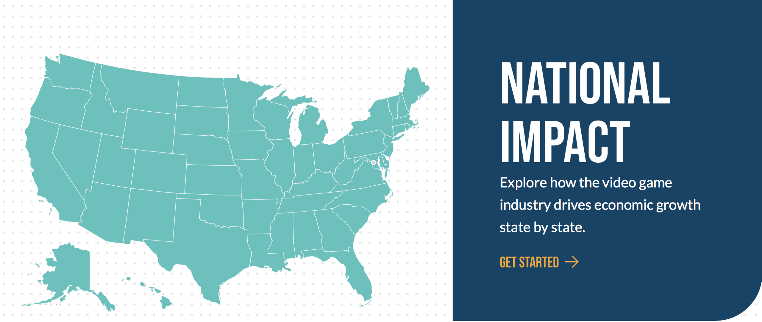
Jake Group has used variants of the shade across several web and print projects across a variety of industries. This color is a versatile and a great neutral shade to get your brand’s message across. Jake worked with the Entertainment Software Association on their website redesign project, and utilized this beautiful blue as an accent color throughout their site.
We are excited to enter 2020 with a great shade of blue to play with in our future client projects! If you’d like to learn more about our web & print projects, please contact us for more information about how you can get on trend with Classic Blue.